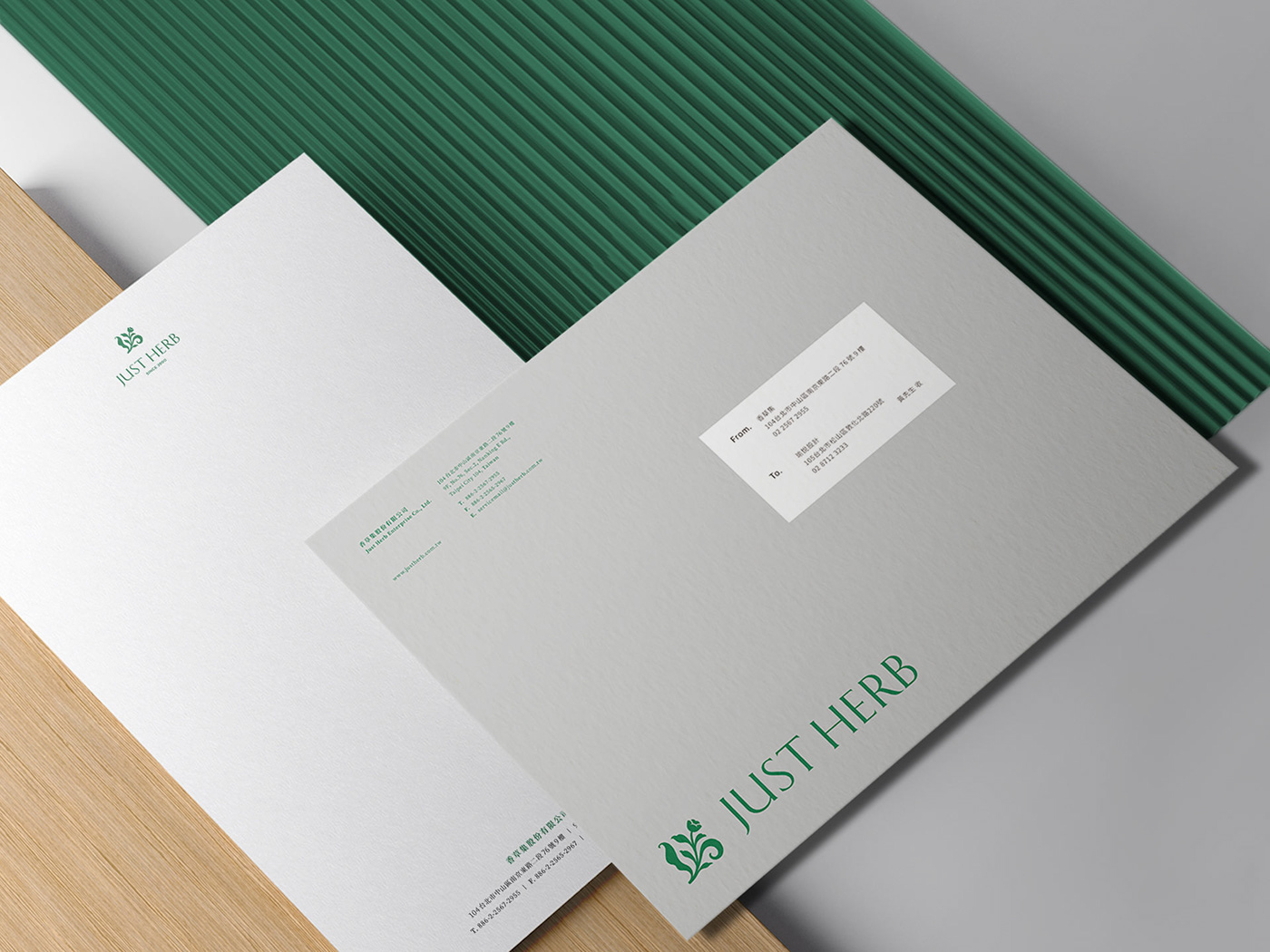
品牌簡介
香草集成立二十餘年,致力於將天然香草融入生活,為繁忙的城市增添一股綠意。今年是一個里程碑,品牌決定做全面的革新,在提升視覺質感的同時保留珍貴的品牌資產。標誌以「保留原始標誌的造型特色」作為重塑的條件:經典的方正造型、生機蓬勃的藤蔓,讓人仍能聯想到是那個親切又熟悉的香草集,但又展現另一種現代、典雅的優美之姿。
Background
Established for more than 20 years, Just Herb is committed to integrating natural herbs into life, and bringing greenness to the busy city. 2022 is a milestone year for Just Herb. The brand decided to make a comprehensive innovation, while improving the visual quality and also retaining the precious brand asset. The team took "retaining the original logo form" as a condition for rebranding: the classic square shape, the vivid vines, still reminiscent of the kind and familiar energy, but also showing another modern and elegant beauty.
設計方案
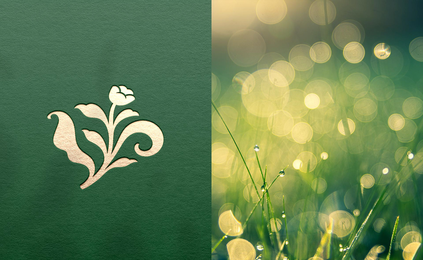
原始標誌造型方正、有著藤蔓及花朵捲曲其中,如同歐洲中世紀手抄書中作為段落開頭字母的華麗裝飾 ”Initial”(放大裝飾字首)。蜿蜒纏繞的「植物」是 Initial 最常出現的裝飾之一,團隊藉此為靈感,結合俐落、帶有襯腳中英文字體,營造知性又內斂的人文氣質。文字筆畫模擬葉片的輪廓,柔軟又帶有韌性,飽含滿滿的生命力。團隊期許全新的香草集能像 Initial 一樣豐實,乘載人情與故事,為喜愛香草的人們開啟一段香氛旅程。
Design
The original logo has a square shape, with vines and flowers curled inside, like the ornate font “Initial” (enlarged decorative prefix) used as the opening letter of paragraphs in European medieval manuscripts. The winding plants are one of the most common decorations in Initial, and the team took this as inspiration, combined with neat and lined Chinese and English fonts, to create an intellectual and restrained humanistic temperament. The strokes of the characters simulate the outline of the leaves, which are soft and tough, full of vitality. The team hopes that the new brand will carry wealthy story and start a fragrance journey for those who love herbs.